 |
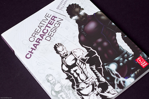
| Creative Character Design by Bryan Tillman |
This is the original cover that I will be re-designing. I felt as if the concept of the cover is nice, but the overall art and the design of the character were a bit lacking. Specifically in the color value / shading in the final character design.
We were assigned to make 4 color semi-comps. This was the first of mine. This one not being exactly my favorite, but I wanted to show the how character design starts with sketching, and I also wanted to give it a comic book feel that the original cover seemed to want to give.
This is my second comp. Here I've introduced what I think is a more interesting character than the one shown in the original cover. I tried to use a more "creative" font choice, although I wasn't 100% happy with this as it gave a too "feminine" feel that might not show that the book gives a wide variety of character design.
The third comp. Using the same character from the second, but showing the steps necessary to make the final. This of course does now show a final character design, I simply colored in areas to show that the final step is adding color. This is the comp I used to carry into my final but it still needs more work done to it such as a background...
My final comp for this assignment. I tried to focus more on attractive typing, settling with ST Scott as the preferred font choice for this project. I will likely be incorporating this gradient effect into the font shown on my third comp (above) which will hopefully help it. However, this design I felt didn't show enough of the character sketches. (but theres no hurt in trying something you didn't try in the other comps anyways)
After discussion with my professor over my four comps, we came to the conclusion that the third comp was the strongest of the four. We also decided on things that would improve it, such as a background with low-opacity character sketches, the gradient in the lower part of the background, and color text. Essentially, this combines elements from all of my comps into one.
After discussion with my professor over my four comps, we came to the conclusion that the third comp was the strongest of the four. We also decided on things that would improve it, such as a background with low-opacity character sketches, the gradient in the lower part of the background, and color text. Essentially, this combines elements from all of my comps into one.


No comments:
Post a Comment